Brand Guidelines
ikimono
Living, breathing brand experiences.
Scroll
Living, breathing brand experiences.
Ikimono — Japanese for "living creature" — is a brand built around curiosity and warmth. The two-tone wordmark, paired with a hand-illustrated mascot, gives the identity a storybook quality that still feels modern in digital product.
Navy grounds the brand in trust; sky blue keeps it light and inviting. The mascot is reserved for moments that need a little delight — onboarding, empty states, celebrations — never for formal or high-stakes contexts.
The primary logo should always appear exactly as shown — never redrawn, recolored outside this guide, or altered in proportion.
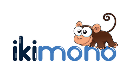
Maintain clear space around the logo equal to the height of the mark's icon on all sides. Never let text, imagery, or the edge of a layout enter this zone.
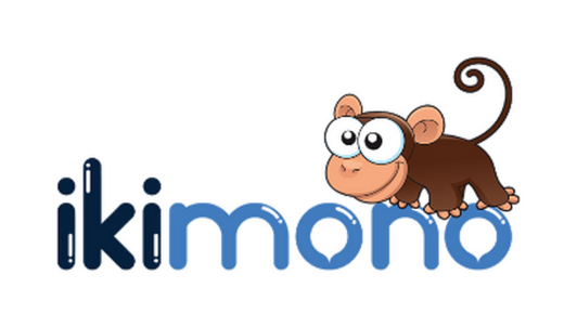 Digital min · 90px
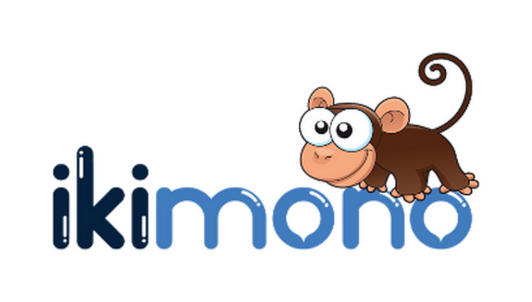 Print min · 0.6in
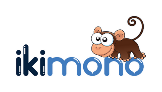 Recommended
Deep navy for trust, sky blue for warmth, with the mascot's peach and brown reserved for illustrated moments only.
Quicksand's soft curves match the brand's rounded wordmark; Nunito keeps supporting copy friendly and legible.
Small distortions compound fast. These four mistakes are the most common — and the easiest to avoid.
Don't stretch or distort the proportions.
Don't recolor outside the approved palette.
Don't rotate or tilt the logo.
Don't place on low-contrast backgrounds.
A quick look at how the mark and palette hold up across common touchpoints.